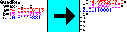
The idea here is quite simple. You already know how to get the the TI-82 to display the graph of an equation, and you have learned how to get it to plot a data set. You are also learning how to get the calculator to determine the equation which best describes a data set. All that remains now is to get the calculator to graph a regression at the same time it displays a data plot.
We could do this by hand by simply entering the regression
equation in the "Y=" screen.
But the calculator already has all the variables from
the regression equation stored in its memory, so we don't need to do this
manually. This section explains the procedure for inserting the regression
equation into the TI-82's equation graphing screen directly from the calculator's
memory.
 |
 |